In the mid-1990s, while working as a full time researcher, writing up my PhD thesis and starting publicspace.net, my arms suddenly started tingling after a good day’s (and night’s) work. Shortly afterwards, my fingers and forearms would be on fire at the end of every day. I started worrying.
Eventually I couldn’t work full days any longer and even just typing a few words or using a mouse would cause pain and discomfort. I started seriously worrying that I had managed to hamstring myself before even making it into a “proper” job.
That’s how my obsession with all things ergonomic started.
A good 20 years later, I’m much healthier and have suffered no RSI related symptoms for at least 15 of those years.
Probably the two most effective things I did back in the mid-90s was to buy an outlandishly weird ergonomic keyboard called the “Kinesis Ergo” and learning to touch type with the DVORAK keyboard layout.

The Kinesis Advantage 2 Keyboard
The Kinesis Ergo keyboard is now in its brand new “Advantage 2” generation, which is an opportunity for a long term review. It looks like something from an alternative (much geekier) universe, but is probably the single best piece of ergonomics I’ve ever bought.
Like all ergonomic keyboards, the Kinesis will do you absolutely no good if you don’t touch type.
Ergonomic keyboards enable you to type without pain and with greatly diminished effort, but you have to learn how to use them. Two finger-pecking at a split keyboard with your wrists fully bent, hammering your fingers into the keys with your keyboard resting on a desk that is 5 inches too high, obviously won’t work.
The point is that it is simply impossible to type on a traditional keyboard without some degree of discomfort, because you just can’t get your limbs into a pain-free position. With the Kinesis Advantage, you can.
A great keyboard, which the Advantage 2 certainly is, goes one step further: not only can you type without injuring yourself, but it also helps you forget about the keyboard, concentrate on what you are writing and makes it feel natural and fun.
Just like lesser “ergonomic” keyboards such as Microsoft’s much loved, but ultimately very half-hearted attempts, the Advantage is “split“, meaning that each hand gets its own separate area and both are physically separated.
This allows your wrists and shoulders to stay in a neutral, un-bent position and is instrumental in preventing carpal tunnel syndrome. CTS is caused by the tendons of your fingers rubbing against the gap between your wrist bones while typing. When your wrists are bent sideways or strongly upwards or downwards that gap narrows and.. ouch!
Also just like other ergonomic keyboards, the Advantage has a “tented” design. This means that both halves of the keyboard have a gently upwards slope starting with your little fingers and progressively rising as you move towards the index fingers. Again this allows for a more natural position of wrists and shoulders.
The Kinesis also uses mechanical key switches: the “Cherry Browns” for mechanical keyboard enthusiasts. There is a debate whether mechanical key switches are truly superior to their scissor counterparts, but it is probably telling that even die hard scissor switch aficionados only claim that they are “just as good”; while nobody claims scissor switches are better. I personally much prefer the mechanical kind.
This, however, is where the similarities between the Advantage and something like Microsoft’s Surface Ergonomic Keyboard or even Matias’ Ergo Pro stop.

Kinesis Advantage Matrix Key Layout
The Kinesis Advantage is part of only a handful of keyboards that don’t use the staggered key rows that originate in the requirements of the mechanical typewriter, but instead uses a columnar (also known as a matrix) layout. All this means is that the keys are arranged in straight columns just like on a number pad.
The sheer stupidity of doing anything else does not hit you until you have used a matrix keyboard for a day or two and go back to a “stupid” keyboard. Who would do this to themselves? Simply arranging the keys in columns eliminates the awkward finger contortions that are such a fun part of touch typing. Yes, our fingers can move sideways, but they really don’t want to, especially when you want to hit something.
There are other matrix keyboards out there, all with their own fan base.

The Truly Ergonomic Keyboard
The Truly Ergonomic is a mechanical keyboard but completely flat with neither tenting, nor enough of a split for my tall frame.
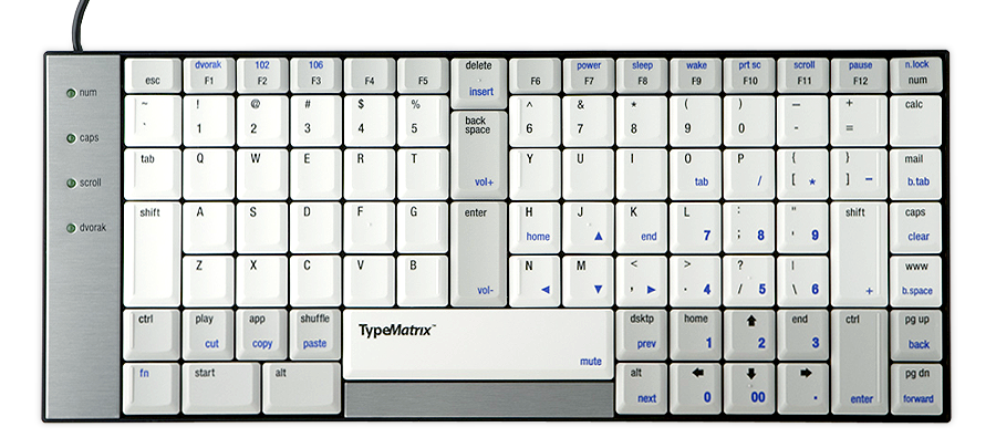
The Type Matrix Keyboard
The Type Matrix is a very similar affair but with scissor switches.

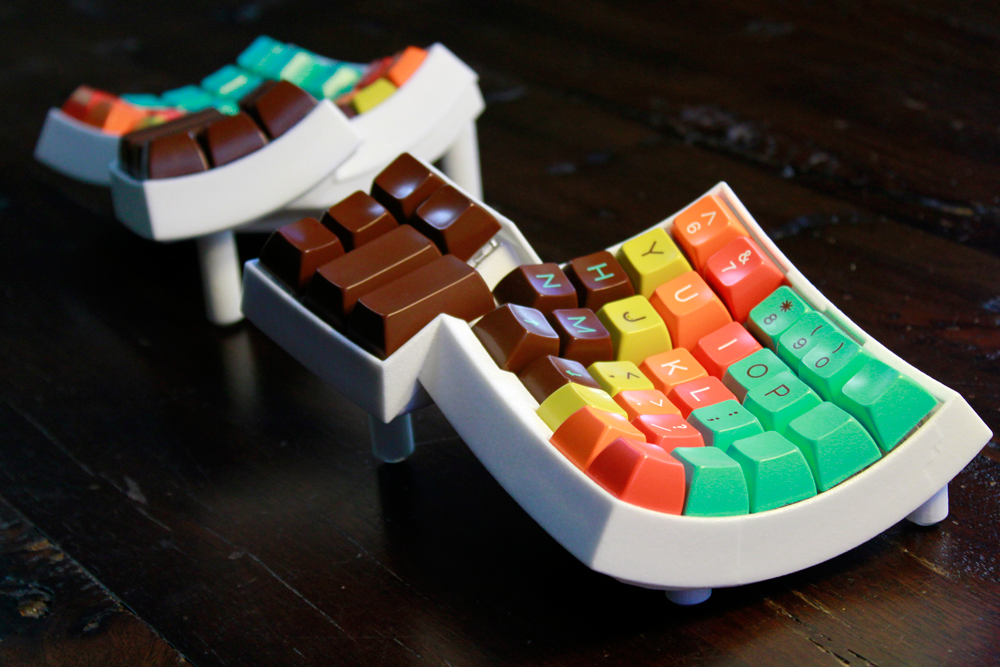
The Latest Ergo Dox Keyboard Iteration
The ErgoDox is an open source DIY keyboard that is mechanical, tented and fully separated. This is the only keyboard I mention here that I don’t own myself. I don’t like the fact that it is “straight” tented rather than Kinesis’ more organic shape, but I can imagine that it is pretty close to the Kinesis and is a real “split keyboard”.

The Maltron 3D Two-Handed Keyboard
The Maltron Two-Handed 3D keyboard is very close to the Kinesis Advantage in almost all respects and I have used it for a few years before going back to the Kinesis. My major gripe is the build quality which is more “bespoke custom job” than what you’d expect from a consumer product.
Kinesis has gone a step beyond simply adopting a matrix layout in the search for the perfect ergonomic fit. Your hands in fact rest in a completely natural “well” taking into account the length of your finger and their natural curvature. Moving your fingers up and down in a straight line always puts your finger tips straight on the keys with no reaching. The new Advantage 2 even has textured and molded home row keys that make it immediately obvious that your finger tips are dead center on their respective home row keys.
Over the years, I have tried to move away from the Kinesis design; mostly in order to have a cheaper and more mobile setup. I spent several agonizing months in 2014 trying to migrate to the Microsoft Surface Ergonomic keyboard after my second Maltron developed yet another dead key, but I could never get comfortable with it.
It took me a while to realize why my attempts to go back to a more standard keyboard were doomed. The real reason is what makes the Advantage so hugely superior to the TypeMatrix and the Truly Ergonomic: the thumb clusters and in-line cursor keys.

Behold the thumb clusters.
The thumb clusters are such an obvious improvement once you get used to them, that is seems impossible that there are keyboards without this feature. The thumbs are the strongest and most mobile fingers and yet on a traditional keyboard both thumbs only hit one miserable key.
Not so on the Kinesis, where each thumb gets its own cluster of keys. You press Space, Backspace and Delete with your thumbs. In fact the Space and Backspace keys are right under your thumbs when your hand is completely relaxed. Your thumb also covers your Control, Option and Command keys, as well as the less important Home, End, Page Up & Page Down keys. The cursor keys are placed in a 4th row that does not exist on other keyboards.
What these design choices amount to is what makes typing on the Kinesis Advantage such a great experience: you never have to move your hands away from the home row.
In all other keyboard designs, some frequently used keys such as the Backspace, Delete, Enter or the cursor keys require you to move your hand, usually the right hand, away from its home row, feel for the key, press it and then awkwardly feel your way back onto the home row.
Not having done this for well over a decade of continuous Maltron and Kinesis keyboard use, this absolutely drove me nuts on the Surface keyboards and I went back to the Advantage.
On the Kinesis, if you’ve mistyped something, your fingers stay where they are and you tap your left thumb to hit backspace. If you need to go back a few characters, bend your fingers until they rest on the cursor keys. Bend them back and you are on the home row again. Your hands themselves do not move.
Personally, I do not use the thumb to hold the Control, Option and Command keys but move my hand to reach the top of the cluster with my index finger; I’m not even sure whether this is as was intended, but it works really well and I’m back on my home row in no time.
On a traditional keyboard, the keys that need to be reached by bending your index fingers laterally (e.g. G and the H key) are very awkward to press. The Advantage does not eliminate this awkwardness altogether, but just sliding the finger sideways places it at the optimal angle to press sideways, making it into more of a poking motion which feels much more natural.
The Kinesis keyboard has the full range of function keys, but they are not much easier to reach than on any other keyboard. For almost two decades, the small function keys were rubber domed atrocities that served their purpose, but felt really cheap, especially when compared to the bank-breaking mechanical key switches used in the rest of the keyboard. In the Advantage 2 iteration these keys are now also mechanical, but while appreciated, this does not genuinely make a world of difference.
The latest model makes a bunch of detailed improvements, but the basic design has been identical since the early 1990s. The on-board programmability, which has always been a selling point is much also much improved.
The only programability feature that I have really used is the ability to switch between QWERTY and Dvorak keyboard layouts automatically. This allows you take your keyboard anywhere and type in Dvorak whether your employer feels like installing that keyboard layout on your machine or not.
The Advantage 2 also lets you easily remap keys, define macros and much else besides. I haven’t had enough time with the latest iteration to play much with the new features.
My only gripe with the Advantage 2 is that it is not yet a fully split keyboard. That would be awesome, but I guess at roughly $350, Kinesis reckons that a hard price limit has been reached. I disagree.
The Dactyl Fully Split Keyboard
There is clearly Advantage-inspired fully split keyboard design available for 3D printing called the Dactyl Keyboard and I wish Kinesis would take that final step, so that I could replace my 3 Advantage keyboards one more time 🙂